If this editor looks unfamiliar, you're likely using the previous version.
Access the right documentation by clicking on the button.
Guides are a great way to provide users with step-by-step assistance directly within your demo. Whether you're introducing a feature, explaining a workflow or guiding prospects through key actions, guides help create a more engaging and intuitive experience.
Step 1: Adding a Guide to Your Screen
To begin, open a screen in your Demo Editor.
If you'd like to add a Post Guide, which is a free-floating text box that appears on top of the screen, click the Guides button in the top toolbar and select Add Post Guide. Post Guides are commonly used for welcome messages, general explanations, or closing notes.
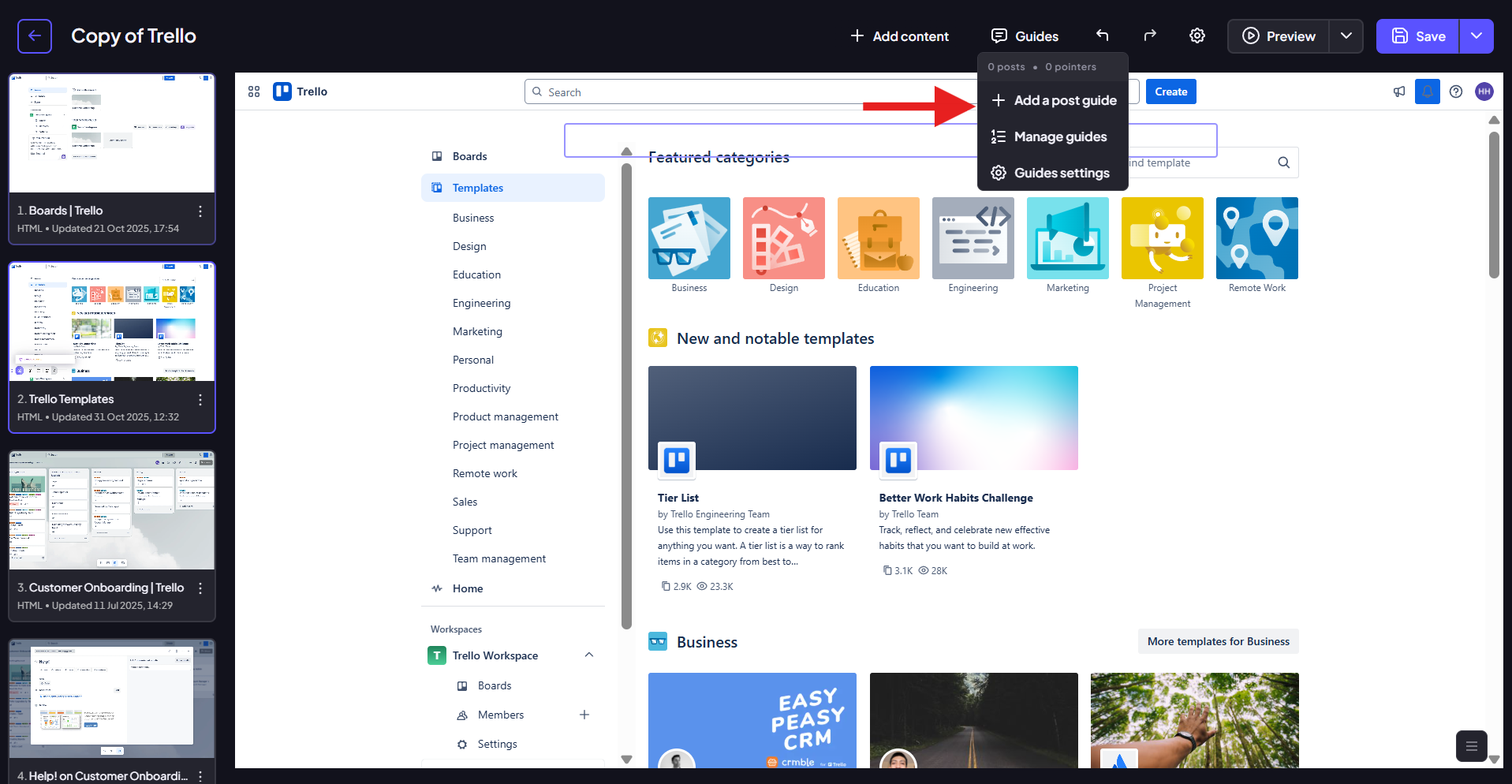
If you want to create a Pointer Guide that points on a specific element, simply click on the element you'd like to attach the guide to. A small menu will appear - select Guide and a new guide will be added to that element.
Step 2: Writing and Editing Your Guide
Once a guide has been added, it's ready for content. Simply click on the guide to open the editor and start writing your headline and body text.
Your changes are automatically saved in real time, so there's no need to click a Save button while working.
As you highlight text, a formatting toolbar will appear, allowing you to apply basic styling such as bold or italic formatting.
You can also use the AI Refine feature located at the top of the guide. This allows you to improve existing content using predefined prompts or your own custom instructions. Whether you want to shorten text or adjust the tone, AI Refine can help you quickly polish your messaging.
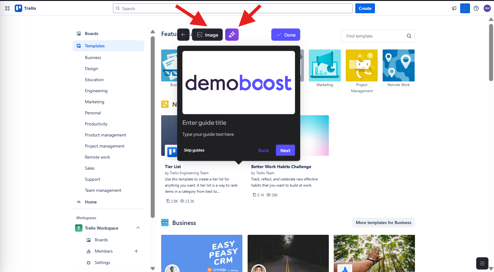
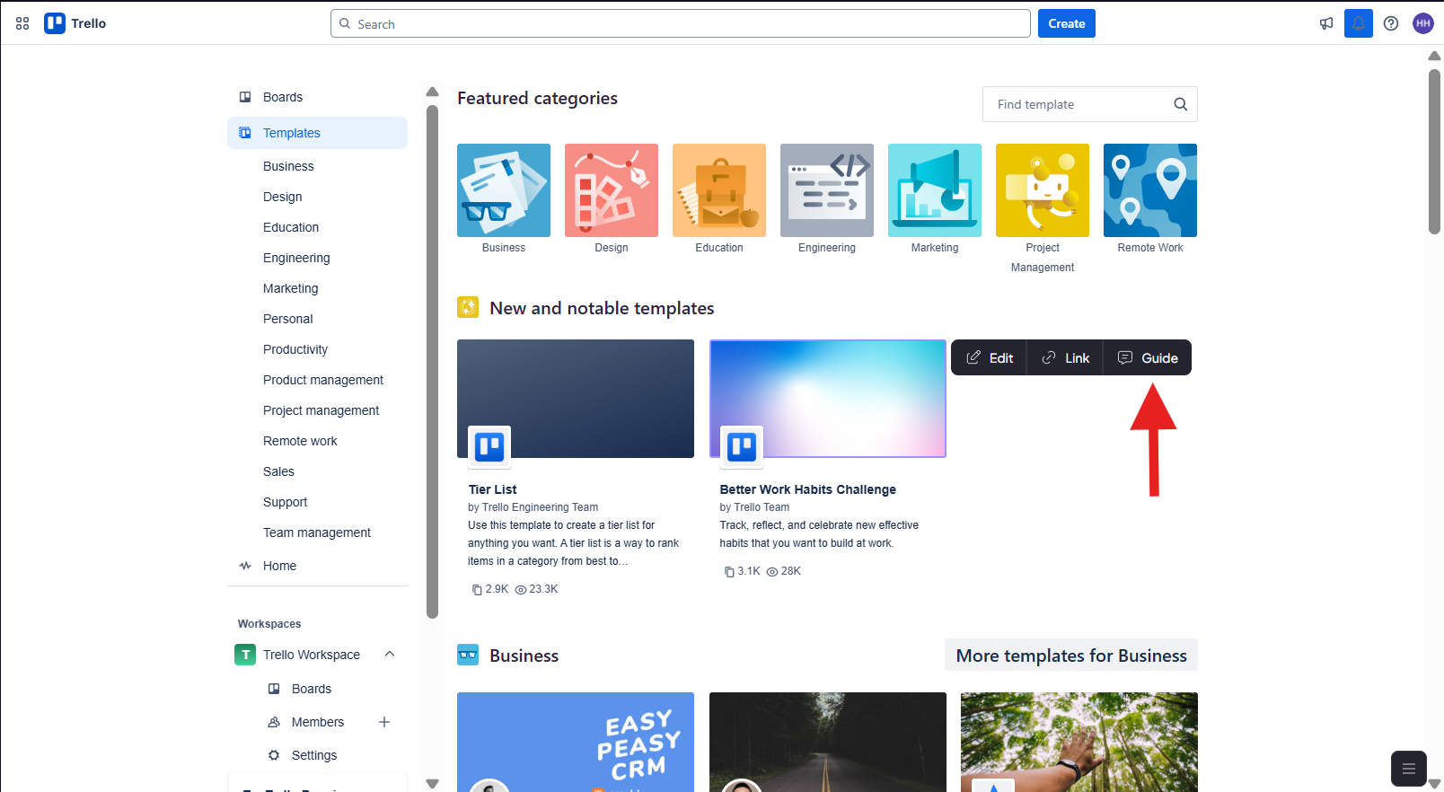
Another useful option is the Image button, which lets you add images directly into your guide. Once added, you can move the image to the top or bottom of the guide, replace it with a different one or remove it entirely.
Step 3: Customizing Your Guide
After your content is ready, you can further customize the guide using the settings panel on the left side of the editor.
Here, you can adjust the guide's position, resize it (this can also be done by manually dragging its edges), and change the order in which guides appear on the screen. You can also add a background overlay to draw additional attention to a specific area of the screen and make highlighted elements stand out more clearly.
You can also add a CTA button inside a particular guide and link it to an external webpage, your calendar or another destination of your choice.
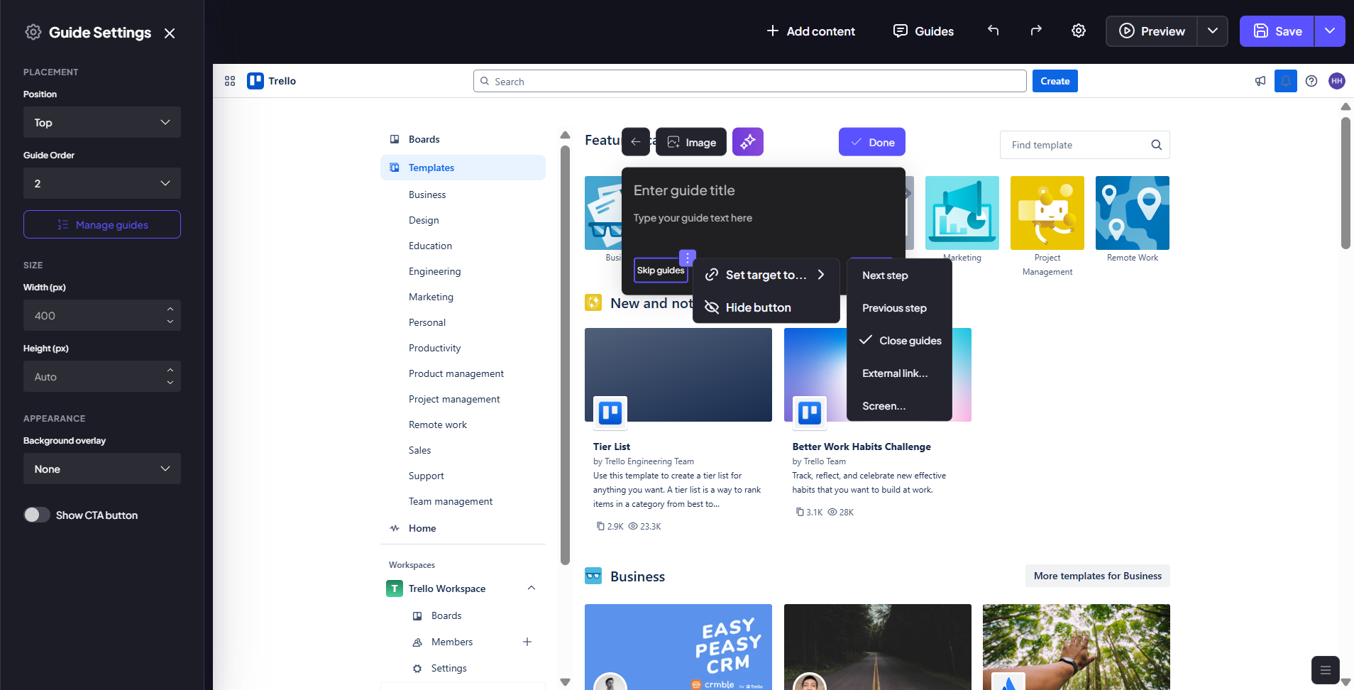
Both CTA and default guide buttons can be customized. You can update the button text or hover over a button and click the three-dot menu that appears. From there, you can change its destination or remove it completely. This can be useful if you'd like to prevent users from skipping guides or create a more tailored navigation experience.
Once you're happy with your changes, click Done to finish editing.
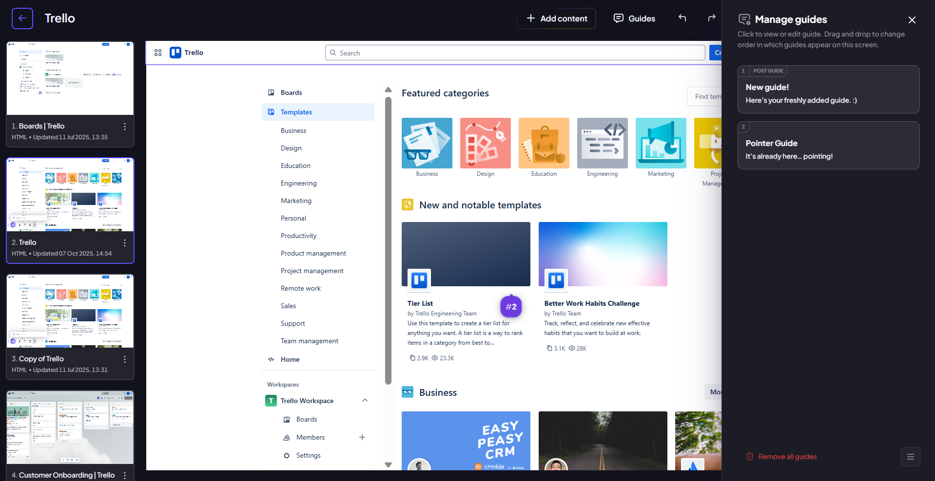
Step 4: Managing Existing Guides
The Guides menu also contains a Manage Guides option, which makes it easy to view and organize all guides created for the current screen.
Selecting this option opens a panel on the right side of the editor, where you'll find a list of every guide associated with that screen. From here, you can quickly open any guide for editing, reorder guides by dragging and dropping them into a new position or remove guides that are no longer needed by selecting Delete from the guide's options menu.
Step 5: Using Global Guide Settings
The final option available under the Guides menu is Global Guide Settings.
Unlike the settings described above, which apply only to individual guides, Global Guide Settings affect every guide across the entire demo. Here, you can update button naming, adjust guide sizing and remove guide buttons globally.
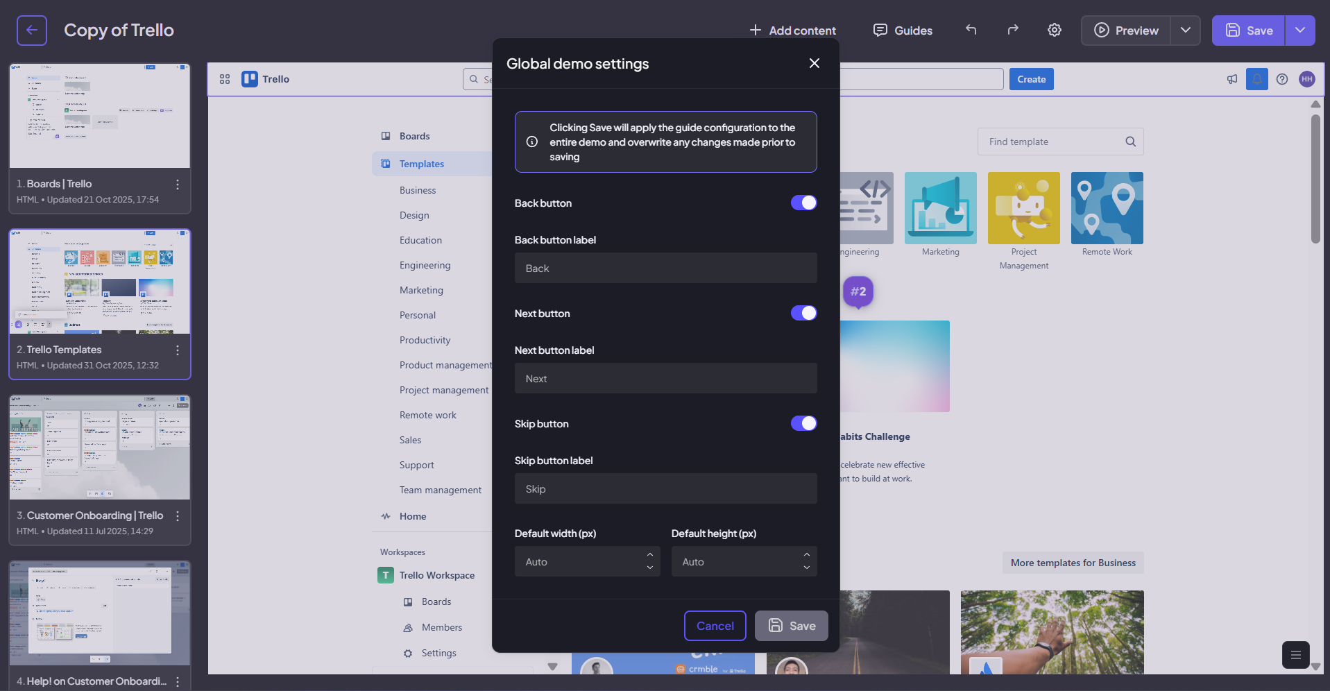
Because these changes apply to all guides at once, we recommend making global adjustments after you've finished creating and arranging your guides. This helps ensure consistency throughout the demo and avoids the need for additional updates later.